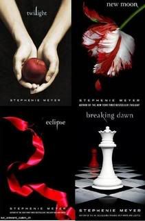
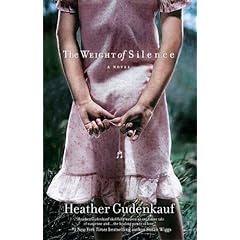
Each book cover is different. Some have a random object or objects (with a meaning that may or may not make sense once you've read the book),


others have a picture of the main location of the story,

and some have pictures that make you curious as to what part the cover plays in the plot.

The picture I have in mind for mine (which may change as time goes on) is something in my story, but not something that would stand out as particularly important unless a person knew what I'll Love You Until was about.
I've imagined what it should look like for months now, and have spent TONS of time looking all over the internet for *just* the right one, but I've yet to find anything close to what I see in my head.
Anyway, here it is... kinda... minus a few specific details of the swing and its surroundings (I realize it's horizontal - and am not fond of the heart cutout, either).

It's so exciting to think about the possibility of a similar cover someday. =)
How do you see your cover? Is it an illustration? A photograph? Does it connect to a specific event, or mean something only the reader would understand? I'd love to hear your creative ideas!
(If you like to look at book covers for research, entertainment or both, check out The Book Design Review for many diverse cover designs. Though Joseph Sullivan has decided to no longer post, the blog is still up.)


6 comments:
I totally do the same thing! I go through multiple cover ideas in my head, and every time I change my title, I also come up with cover art to inspire me. You're not alone.
I imagine my cover would be a photo; something that implies mystery and romance all at the same time.
Oh yes, I definitely do this. I even go as far as to make fake covers for my short fiction, which I know will never see the light of day unless the story is featured on a magazine cover. (Ha! Keep dreaming, Lydia.)
Anyway, I imagined the cover of my first novel (unfortunately, still undergoing revisions) before I'd even heard of Twilight, let alone seen the cover. How is that connected? The cover is very similar: a woman's hand (side view, though, not top view) holding a giant tarantula, against a plain black background. Out of curiosity, if anyone thinks that is intriguing, please let me know. It is very relevant to both the main character and the story.
Cool pic. I design "fake" covers for fun for my books. :) It's fun and it keeps me motivated.
Lydia, I think the hand and a tarantula would be a very intriguing background.
I think it would intriguing too, Lydia. Who wouldn't want to know what the story was about after seeing that?;)
Bethany, I saw that post you had on your blog about making a book cover, and plan on *eventually* trying it out! (Why I didn't add a link to that on this post I don't know!)
No worries, I enjoyed seeing your cover :)
Love the cover idea you chose. A front porch swing conjures up all kinds of things for me: family, relaxation, lemonade sipping and secrets.
It's hard to pin point exactly what makes a cover work, but an evocative image sure makes a person do a double take and possibly want to read the book. Very important stuff!
Post a Comment